Dieser Beitrag wurde aus dem IPython Notebook konvertiert, ich bitte um etwas Nachsicht bezüglich der Formatierung.
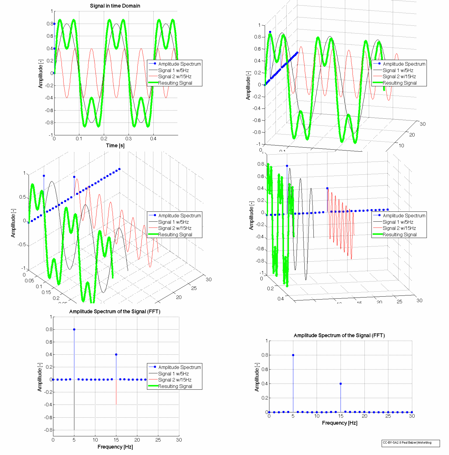
Was macht der FFT Algorithmus?
CC-BY-SA2.0
\(\)
FFT with Python
If you want to know how the FFT Algorithm works, Jake Vanderplas explained it extremely well in his blog: http://jakevdp.github.io/blog/2013/08/28/understanding-the-fft/
Here is, how it is applied and how the axis are scaled to real physical values.
import csv
import pandas as pd
import numpy as np
import matplotlib.pyplot as plt
%pylab inline --no-import-all
First: A synthetic Signal, a simple Sine Wave
t = np.linspace(0, 2*np.pi, 1000, endpoint=True)
f = 3.0 # Frequency in Hz
A = 100.0 # Amplitude in Unit
s = A * np.sin(2*np.pi*f*t) # Signal
plt.plot(t,s)
plt.xlabel('Time ($s$)')
plt.ylabel('Amplitude ($Unit$)')
Do the Discrete Fourier Transform with the Blazing Fast FFT Algorithm
Y = np.fft.fft(s)
That’s it.
Let’s take a look at the result
plt.plot(Y)
Hm, looks strange. Something, which is mirrored at the half, right?!
N = len(Y)/2+1
Y[N-4:N+3]
Can you see it?
And it is something with imaginary parts (the \(j\)) in it. So let’s just take the real part of it with the abs command.
plt.plot(np.abs(Y))
Again, it is perfectly mirrored at the half. So let’s just take the first half.
Amplitude Spectrum
Remember: \(N\) is half the length of the output of the FFT.
plt.plot(np.abs(Y[:N]))
That looks pretty good. It is called the amplitude spectrum of the time domain signal and was calculated with the Discrete Fourier Transform with the Chuck-Norris-Fast FFT algorithm. But how to get the x- and y-axis to real physical scaled values?!
Real Physical Values for the Amplitude and Frequency Axes of the FFT
x-Axis: The Frequency Axis of the FFT
First, let us determine the timestep, which is used to sample the signal. We made it synthetically, but a real signal has a period (measured every second or every day or something similar). If there is no constant frequency, the FFT can not be used! One can interpolate the signal to a new time base, but then the signal spectrum is not the original one. It depends on the case, if the quality is enough or if the information is getting lost with this shift keying. Enough.
We have a good signal:
dt = t[1] - t[0]
fa = 1.0/dt # scan frequency
print('dt=%.5fs (Sample Time)' % dt)
print('fa=%.2fHz (Frequency)' % fa)
Now we need to create a x-Axis vector, which starts from \(0.0\) and is filled with \(N\) (length of half of the FFT signal) values and going all the way to the maximum frequency, which can be reconstructed. This frequency is half of the maximum sampling frequency (\(f_a\)) and is called the Nyquist-Frequency (see Nyquist-Shannon Sampling Theorem).
X = np.linspace(0, fa/2, N, endpoint=True)
X[:4]
Now let’s plot the amplitude spectrum over the newly created frequency vector \(X\)
plt.plot(X, np.abs(Y[:N]))
plt.xlabel('Frequency ($Hz$)')
Yeah! The x-Axis is showing us, that we have a peak at exactly these frequencies, from which our synthetically created signal was build of. That was the job.
The sample frequency was \(f_a=159Hz\), so the amplitude spectrum is from \(0.0\) to \(\frac{f_a}{2}=79.5Hz\).
y-Axis: The Amplitude of the FFT Signal
This task is not this easy, because one have to understand, how the Fourier Transform or the Discrete Fourier Transform works in detail. We need to transform the y-axis value from something to a real physical value. Because the power of the signal in time and frequency domain have to be equal, and we just used the left half of the signal (look at \(N\)), now we need to multiply the amplitude with the factor of 2. If we inverse the FFT with IFFT, the power of the signal is the same.
But that was the easy part. The more complicated one is, if you look at the definition of the Discrete Fourier Transform:
\(Y[k]=\frac{1}{N} \underbrace{\sum_{N} x(nT)\cdot e^{-i 2 \pi \frac{k}{N}n}}_{DFT}\)
In most implementations, the output \(Y\) of the FFT is normalized with the number of samples. We have to divide by \(N\) to get the real physical value.
The magic factor is \(\frac{2}{N}\).
plt.plot(X, 2.0*np.abs(Y[:N])/N)
plt.xlabel('Frequency ($Hz$)')
plt.ylabel('Amplitude ($Unit$)')
Yeah! Job accomplised. Congratulations. But wait…
If you look at the parameters for the original signal (\(A\)), our signal amplitude was not, what is calculated here. Why??
The wrong Amplitude Spectrum because of Leakage Effect
Take a look at the original signal.
plt.plot(t,s)
plt.xlabel('Time ($s$)')
plt.ylabel('Amplitude ($Unit$)')
Do you see, that the signal do not end at amplitude zero, where it started? That means, if you add these signals up, it looks like this:
plt.plot(t, s, label='Signal 1')
plt.plot(t+t[-1], s, label='Signal 1 again')
plt.xlim(t[-1]-1, t[-1]+1)
plt.xlabel('Time ($s$)')
plt.ylabel('Amplitude ($Unit$)')
plt.legend()
And the Fourier Transform was originally invented by Mr Fourier for, and only for, periodic signals (see Fourier Transform). So the Discrete Fourier Transform does and the Fast Fourier Transform Algorithm does it, too.
The signal has to be strictly periodic, which introduces the so called windowing to eliminate the leakage effect.
Window Functions to get periodic signals from real data
There are a lot of window functions, like the Hamming, Hanning, Blackman, …
hann = np.hanning(len(s))
hamm = np.hamming(len(s))
black= np.blackman(len(s))

plt.figure(figsize=(8,3))
plt.subplot(131)
plt.plot(hann)
plt.title('Hanning')
plt.subplot(132)
plt.plot(hamm)
plt.title('Hamming')
plt.subplot(133)
plt.plot(black)
plt.title('Blackman')
plt.tight_layout()
All have different characteristics, which is an own engineering discipline. Let’s take the Hanning window function to multiply our signal with.
plt.plot(t,hann*s)
plt.xlabel('Time ($s$)')
plt.ylabel('Amplitude ($Unit$)')
plt.title('Signal with Hanning Window function applied')
FFT with windowed signal
Yhann = np.fft.fft(hann*s)

plt.figure(figsize=(7,3))
plt.subplot(121)
plt.plot(t,s)
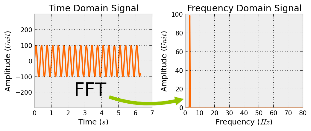
plt.title('Time Domain Signal')
plt.ylim(np.min(s)*3, np.max(s)*3)
plt.xlabel('Time ($s$)')
plt.ylabel('Amplitude ($Unit$)')

plt.subplot(122)
plt.plot(X, 2.0*np.abs(Yhann[:N])/N)
plt.title('Frequency Domain Signal')
plt.xlabel('Frequency ($Hz$)')
plt.ylabel('Amplitude ($Unit$)')

plt.annotate("FFT",
            xy=(0.0, 0.1), xycoords='axes fraction',
            xytext=(-0.8, 0.2), textcoords='axes fraction',
            size=30, va="center", ha="center",
            arrowprops=dict(arrowstyle="simple",
                            connectionstyle="arc3,rad=0.2"))
plt.tight_layout()

#plt.savefig('FFT.png',bbox_inches='tight', dpi=150, transparent=True)
This is exactly, what we wanted to see: A beautiful amplitude spectrum of our signal, which was calcualted with the FFT algorithm.
Now let’s take a look at some real data!
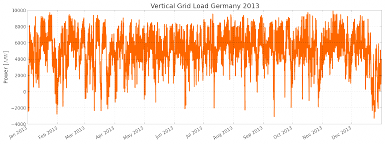
Vertical Grid Load of Germany 2013
“The vertical grid load is the sum, positive or negative, of all power transferred from the transmission grid through directly connected transformers and power lines to distribution grids and final consumers.”
Download the Data from 50Hertz.com
!wget -O 'Vertikale_Netzlast_2013.csv' 'http://www.50hertz.com/transmission/files/sync/Netzkennzahlen/Netzlast/ArchivCSV/Vertikale_Netzlast_2013.csv'
df = pd.read_csv('Vertikale_Netzlast_2013.csv', header=6, sep=';', parse_dates=[[0, 1]], index_col=0, na_values=['n.v.'])
df.rename(columns={'Unnamed: 3': 'Load'}, inplace=True)
Interpolate the missing data
df.Load = df.Load.interpolate()
plt.figure(figsize=(14,5))
df.Load.plot()
plt.title('Vertical Grid Load Germany 2013')
plt.ylabel('Power [$MW$]')
#plt.savefig('VerticalGridLoadGermany2013.png',bbox_inches='tight', dpi=150, transparent=True)
Do the FFT
hann = np.hanning(len(df.Load.values))
Y = np.fft.fft(hann*df.Load.values)
N = len(Y)/2+1
fa = 1.0/(15.0*60.0) # every 15 minutes
print('fa=%.4fHz (Frequency)' % fa)
X = np.linspace(0, fa/2, N, endpoint=True)
plt.plot(X, 2.0*np.abs(Y[:N])/N)
plt.xlabel('Frequency ($Hz$)')
plt.ylabel('vertical powergrid load ($MW$)')
Hm. This is not what we expected. For humans, the x-axis is not understandable. What is \(0.0002Hz\)? Let’s convert it to period, which is the reciprocal of the sampling rate.
The Rythm of modern Life, seen in the Power Grid
Xp = 1.0/X # in seconds
Xph= Xp/(60.0*60.0) # in hours
plt.figure(figsize=(15,6))
plt.plot(Xph, 2.0*np.abs(Y[:N])/N)
plt.xticks([12, 24, 33, 84, 168])
plt.xlim(0, 180)
plt.ylim(0, 1500)
plt.xlabel('Period ($h$)')
#plt.savefig('VerticalGridLoadGermany2013-FFT.png',bbox_inches='tight', dpi=150, transparent=True)
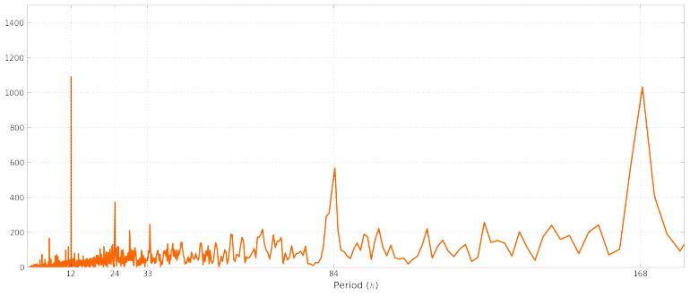
Aaaaah! Now we see following peaks:
12hday/night rythm24hdaily rythm33.6hsomething? Any suggestions? [Edit: see comment from Markus Meinert: These are harmonics of the weekly rhythm, i.e. 168h/2 and 168h/5. The weekly rhythm is not sinusoidal, it’s rather 5 days on, 2 days off, therefore you get higher harmonics.]84.2hsomething? Any suggestions?168hweek rythm
Der gleiche Datensatz mit Matlab ist hier zu finden: FFT mit Matlab


20 Comments
84.2 approx 3.5*24h, half week rhythm.
Corresponds the amplitude of the frequency component to the absolute value = length of the complex vector or to its real part = component along “x-axis” ?
The text says real part, but you use the abs() function.
For future readers: the amplitude corresponds to the length of the complex vector, so abs(.) is correct.
abs(.) returns a real value, of course, but it’s the standard sqrt(im^2 + re^2), not re(.).
I googled for the 33.6 h rhythm. This is the average interval between two sleeping times if you stay in a room with constant light conditions. Very interesting.
And thanks for your explanation on FFT. Helped me a lot!
when you do Xp = 1.0/X there is a division by zero. I think the DC value should be excluded from the period calulation.
Guten Tag, thank you for perhaps the ONLY complete yet simple example of numpy.fft.fft that I have read. I have been able to use this example to clarify for myself how to properly apply the computational structure. I only had one question; where is the np.pi value in the above calculations? Not even sure this is a sensible question but I thought the y-values had to be in radian form, hence x 2*pi. Llew
Sample data are no longer available. You can download a dataset from this website (http://www.50hertz.com/de/Kennzahlen/Vertikale-Netzlast/Archiv-Vertikale-Netzlast) now.
The data however seem not to be the same, so you have to make some adaptations in your software:
df = pd.read_csv('2013.csv', header=3, sep=';', parse_dates=[[0, 1]], index_col=0, na_values=['n.v.'])
df.rename(columns={'Vertikale Netzlast [MW]': 'Load'}, inplace=True)
Anything else seems to work although graphics are different and don’t show typical spectrum and peaks. Sorry.
Thank you!
Sorry, just a little but substatial amendment:
df = pd.read_csv('2013.csv', header=3, sep=';',thousands='.', parse_dates=[[0, 1]], index_col=0, na_values=['n.v.'])It is data from Germany and they use a thousands delimiter there. Everything works fine now.
33.6h is the fifth part of the week. Could be that this part of the frequency spectrum represents the 5 day working week.
Yeah! That sounds plausible. Thanks
Thanks for the great tutorial! I have a comment about the the peaks at 84h and 33.6h. These are harmonics of the weekly rhythm, i.e. 168h/2 and 168h/5. The weekly rhythm is not sinusoidal, it’s rather 5 days on, 2 days off, therefore you get higher harmonics. Same is true for the daily rhythm. When you look closely, you see harmonics at 24/2, 24/3, 24/4 and so on.
I had some trouble with downloading good data. I took data from here: https://www.tennet.eu/de/strommarkt/transparenz/transparenz-deutschland/netzkennzahlen/jahreshoechstlast-und-lastverlauf/
Unfortunately, one has to download data in a month-by-month fashion and finally assemble by hand.
Danke!! Habe ich direkt mit in den Beitrag aufgenommen.
Hi, thanks for putting all this together.
Was very useful for me to get started on this topic.
Now that I look at it after a few months of cracking my head with digital signal processing theory I have one comment.
Right at the start you write:
“So let’s just take the real part of it with the abs command”.
I think thats a bit confusing since we take the fft result in real/imag format and NOT take the real part of it but calculate the amplitude (=length of the real/imag vector) as in phase/amplitude format.
So the code is right in the context of what you are trying to achieve but strictly speaking you’r not correct with your nomenclature. I’d propse you write “So let’s convert the real/imag format in the more comprehensive amplitude/phase format and have a look at the amplitudes.”
Regards, Christof
I think that is what George also mentioned on 12. April 2016
Klasse Beitrag, vielen Dank! Endlich ein verständliches, vollständiges und hilfreiches Beispiel zur FFT in Python. Findet man nicht so oft im Netz :-)
In my opinion multiplying the grid load with the hanning-window-function results in an unwanted weighting of the original values. I think, the values in the middle of the year impact the frequency spectrum more than the values at the beginning or end of the year.
Is my understanding correct? Is there any possibility to work around this?
Fucking Awesome. Thank you
Fucking Awesome. Thank you!!!